Reorganising navigations
How we reviewed information architecture to create opportunities.
Company
Guidion
Context
Guidion is a B2B2C field service marketplace that connects TV and energy providers, technicians and customers with across the Netherlands and Germany. To support our operations, we had out HomeApp, an app that allowed technicians to set their availability and receive information about their tickets, routes, and materials. The tricky part is that it was created without a UX representative, so we have encountered several usability problems.
What I did
— Stakeholder management
— Research
— Information architecture
— User testing
— Prototyping
Challenges and problems
No room for growth
New features don't fit on the old structure
Flow problems
Created without UX, some user flows didn't work
Useless menu items
We used strategic parts to non-strategic items
Old structure
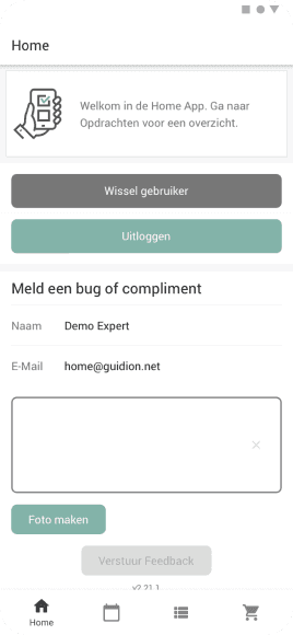
Home
- Change account
- Logout
- Send feedback
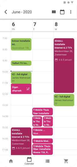
Calendar
- Calendar overview
- Absence
- Availability
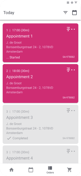
Orders
- Work orders
- Tasks
- Receipts
- Sold + used products
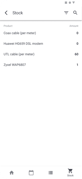
Stock
- Warehouse overview
Card sorting
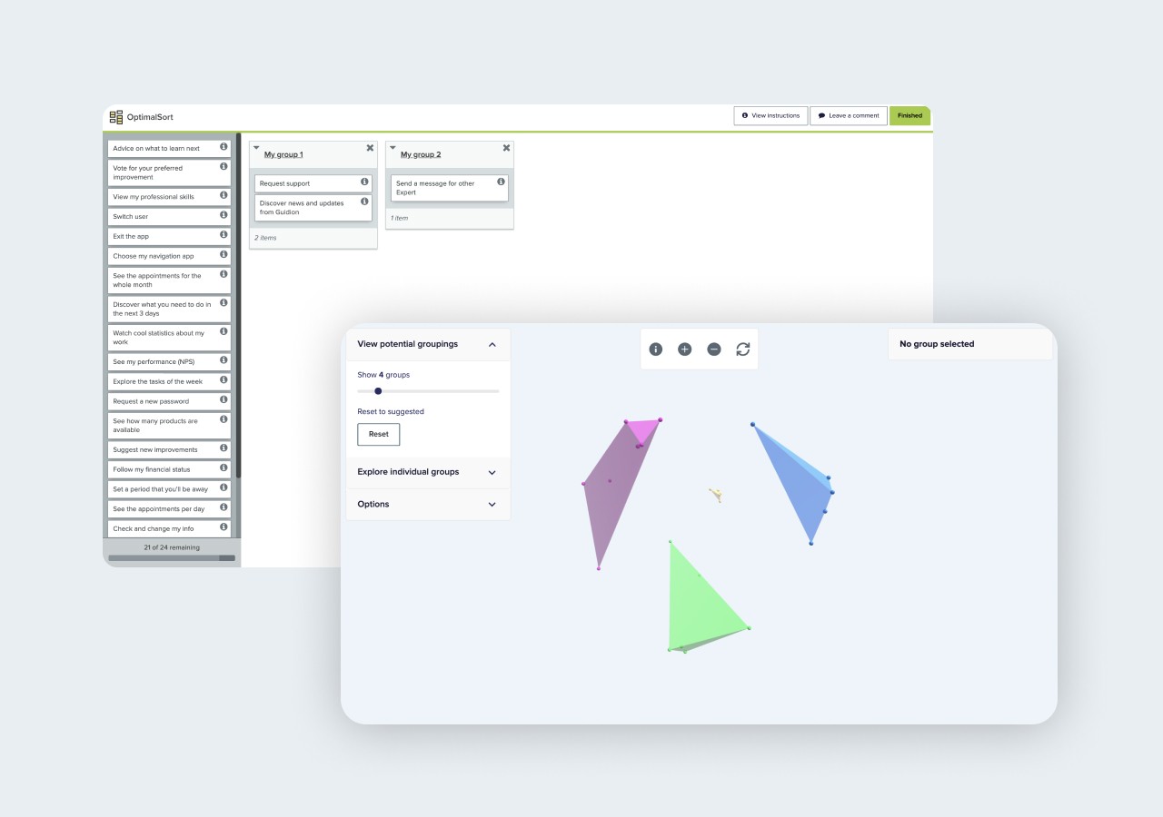
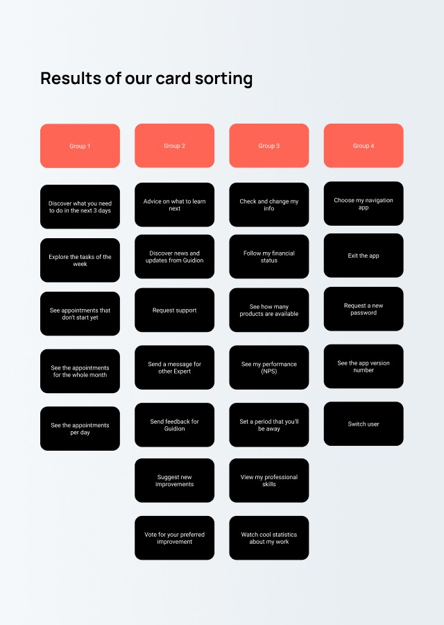
We started to understand how we could organize, logically, all the features that we have, and prepare to receive the main features from our roadmap. To do it, I executed with our stakeholders (experts, expert managers, and the legacy product team) an open and unmoderated digital card sorting. That means that users could organize the card as their mindsets.
Using the Optimal Card Sorting solution, I created 24 cards without features, just describing the day to day tasks that could be executed with our app. I asked users to organize it in how many groups they want and to give names for these groups.
I was curious to see a mindset pattern through the results and see some experts organizing it per-user level.
Mapping
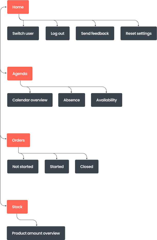
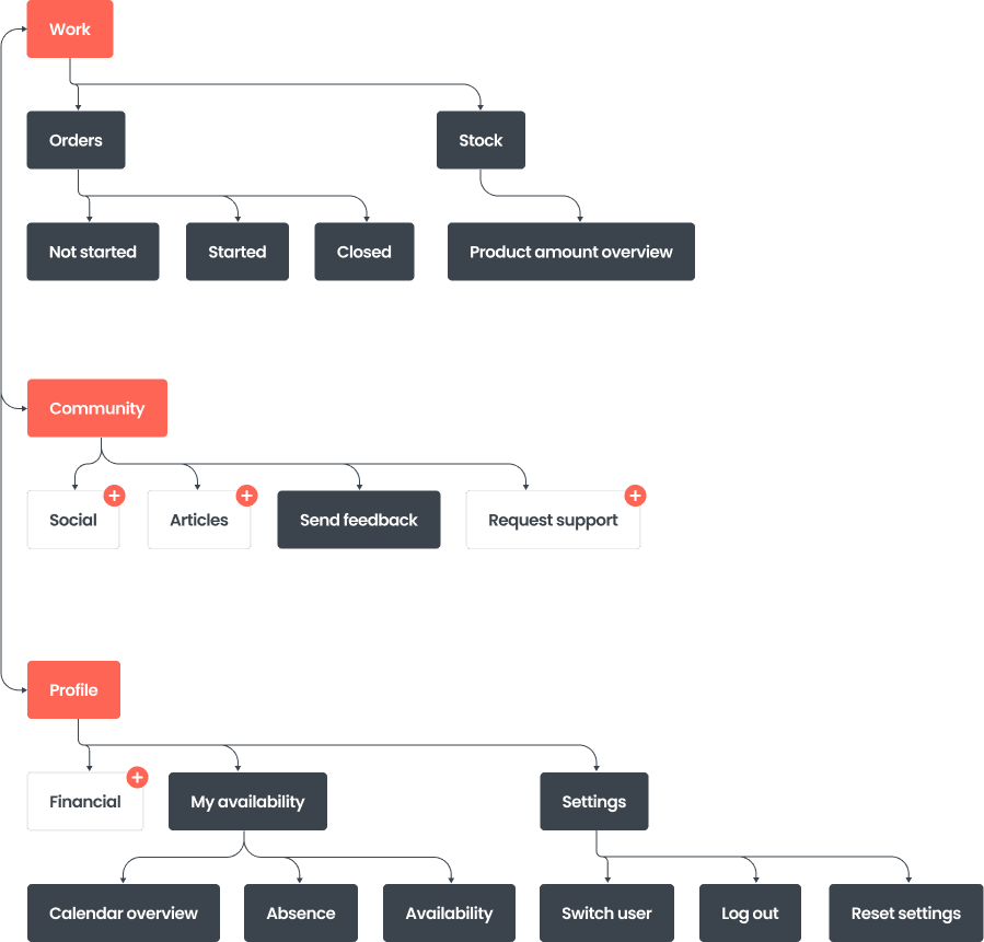
With the card sorting done, and the answers summed, it was time to start to create a map that I did use Google Draw to understand how these results could be organized.
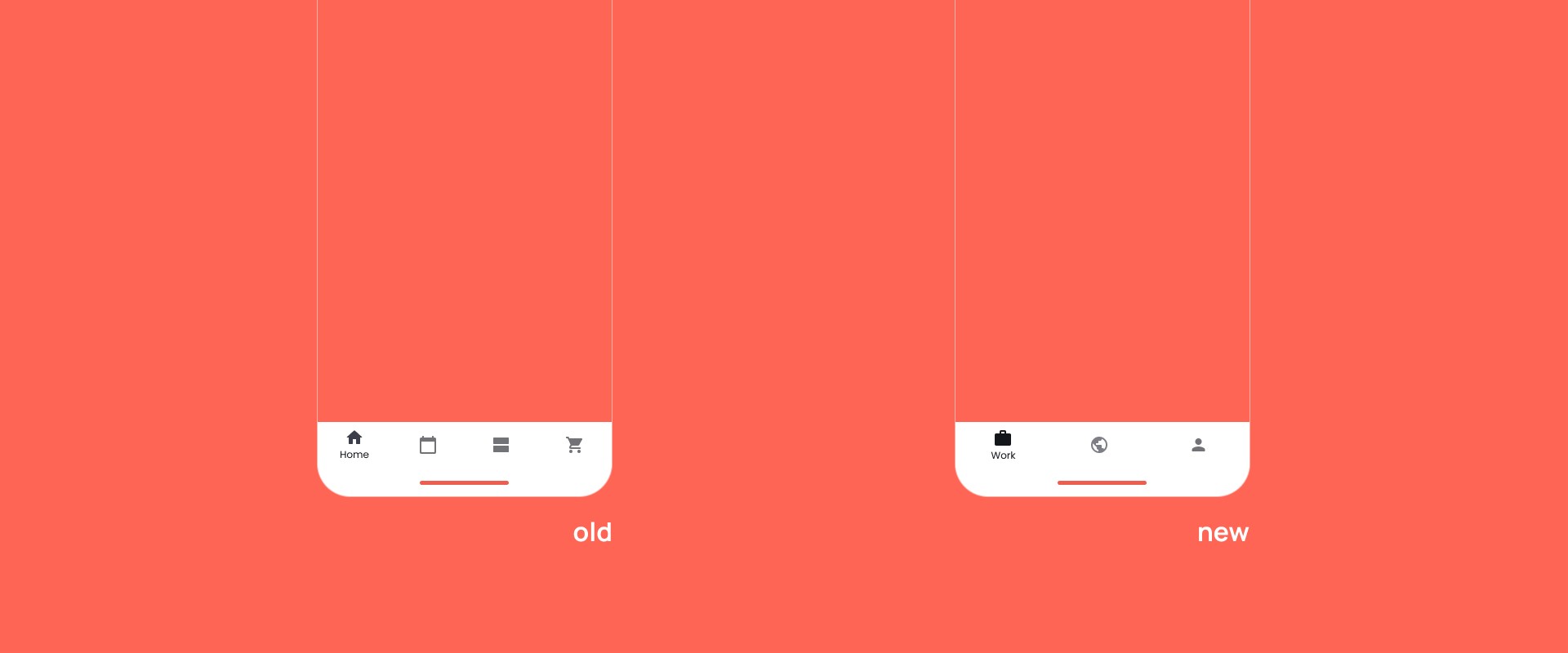
Old architecture
New achitecture
Home
- Change account
- Logout
- Send feedback
Calendar
- Calendar overview
- Absence
- Availability
Orders
- Work orders
- Tasks
- Receipts
- Sold + used products
Prototyping
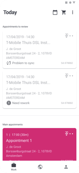
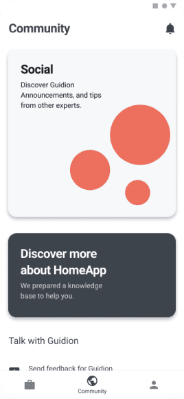
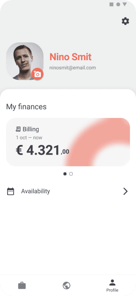
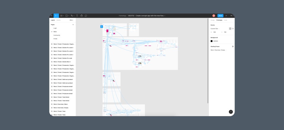
To test it, I created a prototype in Figma, reorganizing the features and screens that I already had, and creating a flow for these screens.
The result is a simple app that runs similar to what we are planned to have.
Testing
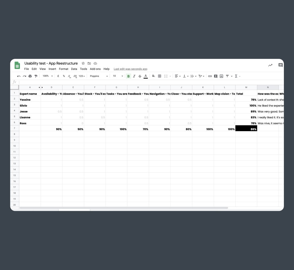
With the prototype ready to be tested, I created Google Sheet to collect, organize, and share the results with the team. The logic is simple. If the user can do the task without doubts, I give 1 point for it, if the user has some doubts but can do it without explanation 0,5, but if the user can't do it, it's zero points.
I did it simple but effective:
- Sharing the prototype with the users.
- Requesting they to open it and share with me their screens.
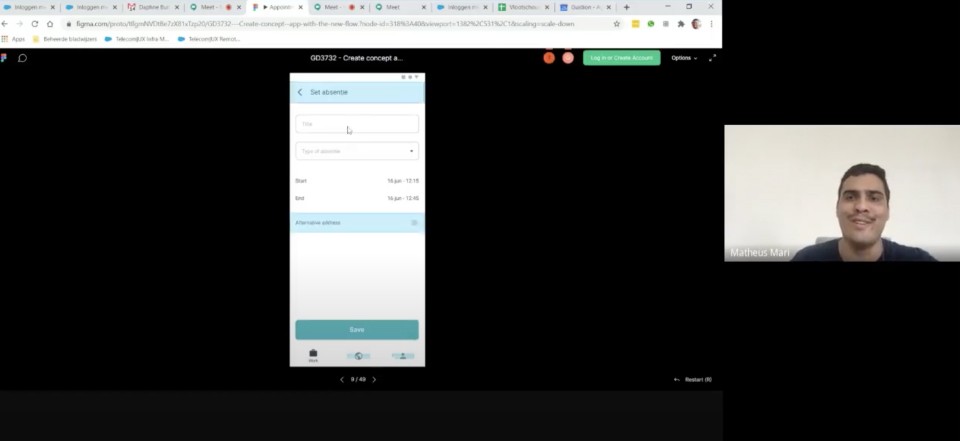
- Asking for permission to record it (to analyze the records after, with more time to do it).
- Executing it together.
My main goal is to have more than 80% of success and discover what are having more doubts.
Outcomes
-3 Useless tab
The app doesn't have home, agenda and stock anymore
+2 New tabs
With community and profile, we have room to grow
Did you liked it?
